Example Welcome Messages For Real Estate Websites
Perhaps you are setting up your WordPress site for your real estate business and see the homepage section that is encouraging you to describe your business to prospective clients.
What do you put?
Probably a lot less than you would like.
A good real estate website welcome message is going to focus on action, value propositions, and the next thing. It is an elevator pitch, not an essay.
Look at some examples below of how some top brokerages make their elevator pitch to website visitors.
Website Introduction Examples
How do I find the best real estate agents for inspiration?
I look at some of the broker clients of top real estate website providers and real estate marketing companies, like Real Estate Webmasters, Curaytor, and 1000Watt.
These are agents who likely mastered marketing. Copy what works! Don’t reinvent the wheel!
Leading with the Agent Bio

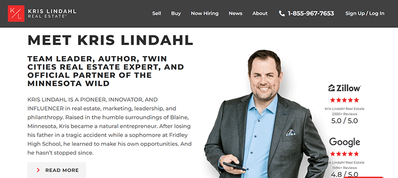
Kris Lindahl’s bio is the second feature on his homepage and links directly to his About page.
If your personal brand or bio is central to your value proposition (e.g. military clients), then featuring those relevant elements of your bio may be relevant to prominently include.
Leading with the Value Proposition

Fidelis South features their value proposition for military buyers on their homepage.
This isn’t a “welcome message” per se but part of their overall customer messaging on their homepage.
Real estate value propositions differ from mission statements in that they are attached to a specific benefit, in this case, experience with VA loans. Consider featuring these prominently in your introduction to your brand!
Leading with the Mission Statement

The North Group has a beautiful website that accents their tagline: Experiences Worth Talking About.
The first feature on their website is a short blurb that appears to be their mission statement, and keeps to the experience theme by pointing visitors to the buyer or seller experience paths.
If you don’t have a mission statement already, then you are already behind! Read up on mission statement examples and craft your own!
Leading with a Welcome Video
All in Miami is all in on video with a video header on their Curaytor site. There is a prominent play button above the fold to encourage visitors to click!
The video was a quick introduction to the team and each member’s contributions to the customer’s experience. The current video features over 20 minutes of Miami real estate and skylines.
Lower on the homepage they include yet more video about their selling strategies.
Leading WITHOUT a Welcome Message

Today’s consumer is tech-savvy with a short attention span. If you think they are on your page to learn more about you or read a paragraph of text, you are wrong.
Many of the top websites do not have a homepage welcome message.
The Group is a 1000Watt client and an example of a site with a minimalist approach to the homepage. It features the most popular listings, latest blog posts, and….that’s it! The menu is the only other navigation feature for clients to begin interacting with the brand.
I like this style. It is simple and encourages users to explore on their own.
SMS Welcome Text for New Contacts

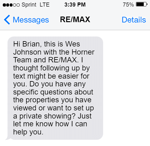
After your potential clients have signed up with their contact details, you probably are ready to send them a welcome text message!
The above is a real example of a real estate text. Notice how it has almost no “welcome-y” content. It gets to the point and, like a good homepage, focuses on action. Do you want to see homes? Do you have questions? There is no fluff about how they’re an awesome agent and all the different steps. The goal is to get in contact.
Easy Agent Pro has a list of other text scripts you can consider using in your nurture campaigns.
Welcome Message Tips
- Don’t Confuse the Welcome Message with the About page. Top sites prominently feature action items like buyer search, home valuation call-to-actions, testimonials, taglines, and links to neighborhood pages. These encourage action. Your welcome message shouldn’t distract your visitors from taking action. Keep your five-paragraph biography on your About page where they can find it when they’re ready.
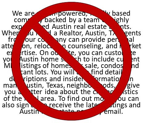
- No “Wall-of-Text”. I am guilty of this on my own site. Keep welcome messages short – 1 to 2 sentences. Stick to something that might fit in 240 Twitter characters, designed to be pithy while keeping people’s attention. Don’t try to explain your entire business at once. If you do have several points to make, break them up into bullet points or small paragraphs with headings so a reader can quickly scan them.

Conclusion
Most of these websites do not have a typical “welcome message” like you may have imagined. There is no long introduction. No syllabus or orientation materials.
The time for that is later. The initial welcome message should be short and sweet, the beginning of the customer’s experience with you and your real estate brand. Focus on the experience they can expect and your value proposition, and point them in the right direction to get what they want from your website.
Updated March 28, 2023; Originally published April 26, 2021


