Real Estate Website UX Best Practices in 2021
A real estate transaction is a high dollar business opportunity. Missing even a single opportunity can cost you $1000s or $10,000s.
As agents, we know about prospecting. We know about lead nurturing. We know about good service and asking for referrals.
But if you’re a broker for whom your website is a centerpiece of your business, you may be missing an entire class of potential clients whose name you never knew. You didn’t get their name because your form didn’t work. Or your email auto-responder wasn’t delivered. Or your clunky website drove them away to your competitor. Or your forced registration scared them away.
Or worse, you implement something you think is an improvement, ignorant that the rest of your website visitors think it’s an abomination. You’re left wondering why your lead flow dried up.
What you need is some UX help!
UX, or user experience, is the term for the somewhat vague science of making your customers happy. And I don’t think it gets enough attention from agents, brokers, and marketing officers.
For this article, I had the great fortune of speaking with Katie Ragusa, VP of Product Development with custom real estate software and website developer TRIBUS, and a UX expert. Katie is a leading professional in our industry, a former agent herself, and is heavily engaged with Inman and our MLS industry.
UX versus UI versus CRO
There are some closely related terms dealing with website UX that are sometimes used interchangeably, but are distinct.
UI – User Interface
User interface refers to the actual mechanism with which customers interact with your site, product, or company. Your website, its forms, the buttons, and even the third-party tools you use like DocuSign and email are all elements of your business’ user interface.
Having an intuitive and easy to use user interface is best for delivering a good user experience and high conversion rates.
UX – User Experience
User experience refers to … your customer’s experience! It is much more broad than UI, and includes your offline user experience.
Your personal interactions, phone calls, and analog services for your real estate customer are also part of their “user experience”. Show up late for an appointment? That is bad UX!
As most often applied, however, UX refers to your customer’s experience on your digital products like your website or software. Did they get what they wanted from your blog article? Did they get what they expected to happen when they clicked a button? These are UX questions.
CRO – Conversion Rate Optimization
There are lots of reasons to have good UI and UX. Happy customers. Great reviews. Building a professional brand.
But your goal is probably to convert more opportunities into clients.
On a website, that is called a conversion. And your conversion rate is the percentage of website visitors you convert into a lead.
Therefore, conversion rate optimization (not to be confused with search engine optimization) is all about improving the percentage of visitors who turn into leads, clients, and business. It’s about sussing out why people “bounce” from your page. It’s about finding the optimal number of form fields before a user gets bored and leaves.
Does asking for a phone number turn away too many people? Is there a clear call-to-action on your landing pages? Do you need a pop-up to convert visitors browsing your content pages?
If you already have a fair amount of website traffic and your lead generation and SEO strategies are maxed out, improving CRO is a great way to continue growing your business without having to grow your traffic.
Biggest UX Mistakes Agents Make
So lets see a few things you may be doing wrong on UX already.
Below are some of Katie’s most observed UX mistakes made by agents and brokers:
Forced Registration
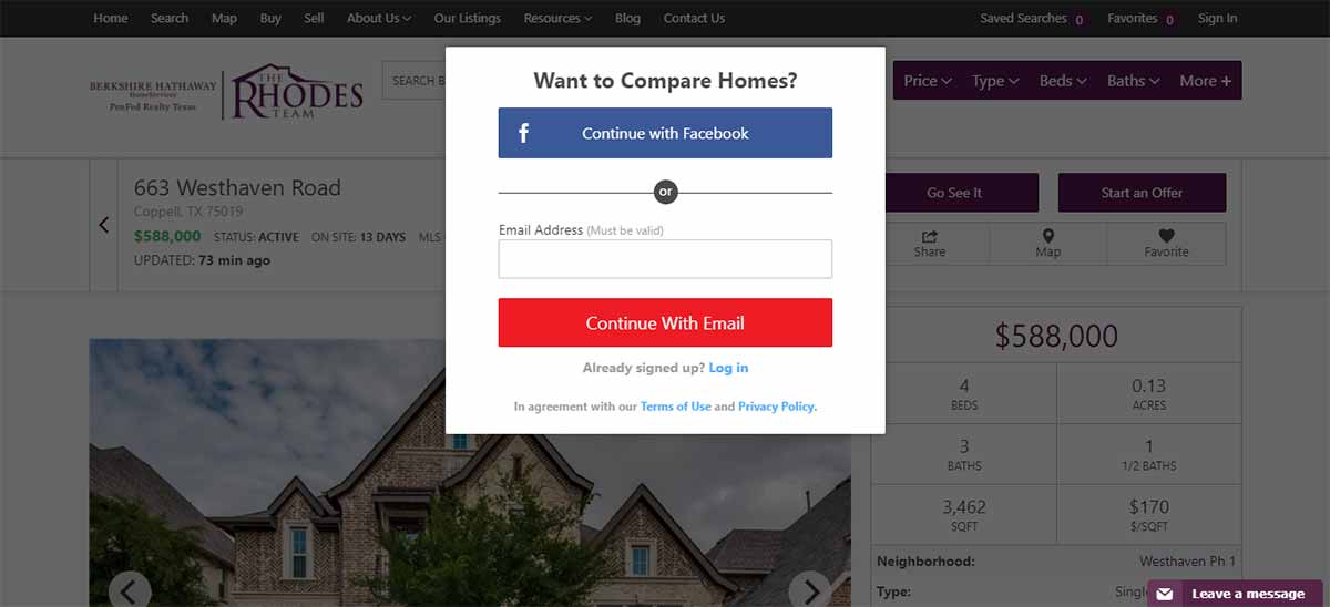
To force or not to force registration? That is the question.
It’s a question as old as the real estate website. And there isn’t an answer because the answer is “it depends on what type of website you have“.
But Katie notes that often she sees websites forcing registration too soon on folks browsing homes.
Forced registration has its place. Lead generation websites that thrive off of PPC and Facebook ads like BoomTown and CINC include forced registration. It’s important when you’re spending money per lead that you maximize every opportunity to connect with that lead. But that doesn’t do you any good if you drive that lead away with forcing registration before they’ve gotten value from your site.
Most websites and website providers let you set forced registration rules, forcing it after 5 property views, for example, or limiting it to a “soft” ask where the user can click out and continue browsing if they want.
I personally do not force registration. I get fewer but, I think, better leads.
Putting the Agent First
You are not first. The home buyer or seller is.
Visitors on your site are not there to learn about where you grew up or what your interests are.
Instead, they probably want something, and hopefully it’s real estate related.
Give it to them, front and center!
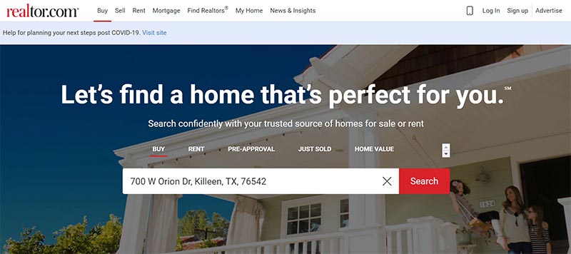
Often what they want is to search homes for sale or find out how much their home is worth. On most sites, these should be prominent on the first page. Big sites like Realtor.com have that as their only significant content above the fold.
But what about “brand sites”?
Brand sites are not lead generation sites focused on browsing homes. Some agent brand sites don’t even have IDX functionality at all! Aren’t these all about the agent, their brand, and putting them first?
I asked Katie if it was okay to break the rules for “brand sites” and make the site agent-centric.
No.
If you have a brand site, her recommendation is to focus on content and the story. The site is about providing value, whether it’s insights into the community, housing trends, local events, or whatever else your brand story is about. Make your site about giving value, not talking yourself up.
Failing to Tell a Story
This would seem to contradict the previous rule. Except the story isn’t your story – it’s the customer’s story.
Understanding the customer journey and integrating it into your message is important for making a connection quickly to a complete stranger online. It’s all about empathy with their situation, as well as the classic sales principle that you are selling benefits, not features.
Does your home buyer want a house? No. They want an affordable home that won’t stretch their budget while accommodating their growing family.
Does your home seller want to sell a house? No. They want to make enough after the transaction costs to be able to build a pool in their new house for when grandkids visit.
Telling a story means keeping your customer avatar in mind as you craft your website and message.
Examples of Great Real Estate UX
There’s no excuse for the big boys not to have some solid UX. Their websites are the centerpiece of their business, and they have a team of professionals testing and refining their UX and UI.
I am a big fan of not reinventing the wheel. There’s no shame in using them to jumpstart your quest to better UX.
Below is an example Katie recommended from Redfin: the showing schedule form.
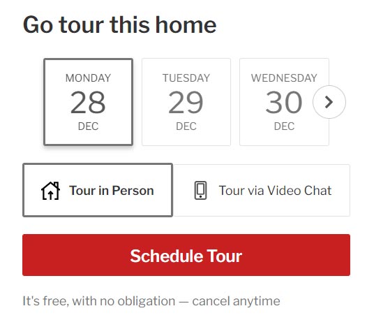
Clicking on “Schedule Tour” takes you to the following page:
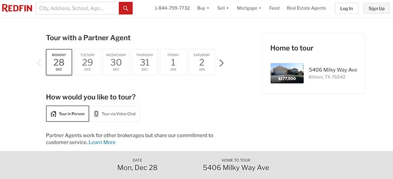
A lot of the other portals have gotten better at their scheduling UX and visual design, similar to Redfin’s simple-to-use widget here.
I also think it’s clever to focus on scheduling showings. This goes beyond simply “request a showing” and sending an email. A buyer can actually schedule the home tour right from Redfin. No email back and forth. Anything that gets buyers what they want faster is going to benefit the company that can deliver.
Measuring UX
Measuring UX can be tricky. Some of it is subjective.
Userzoom has a useful intro into some of the possible metrics on which usability can be tested, both qualitative and quantitative.
Ultimately, “task completion” is your most important metric, depending on your goal. Did the user do what you wanted them to, whether that was submitting their email, scheduling an appointment, or downloading a buyer guide?
Your conversion rate is the most basic UX KPI, measured as conversions / visitors. However, even conversion can be misleading. A real estate site with an article about the best local restaurants may have a low conversion rate. Folks visiting that page are probably looking for restaurants, not Realtors. But the visitors and brand opportunity might be worth it nonetheless. Eliminating low converting traffic might be a good way to boost a conversion rate, but does that help if you are getting fewer eyeballs on your brand?
UX Tools
I don’t think many agents understand just how easy it is to spy on people online. Spying in a good way! But as you’ll see below, it is possible to track every click, mouse move, and navigation decision that your website visitor makes.
Tracking these behaviors can clue you into what folks like and dislike about your site, and how they are using it. Are they using it as you intended, or getting frustrated and leaving?
Hotjar
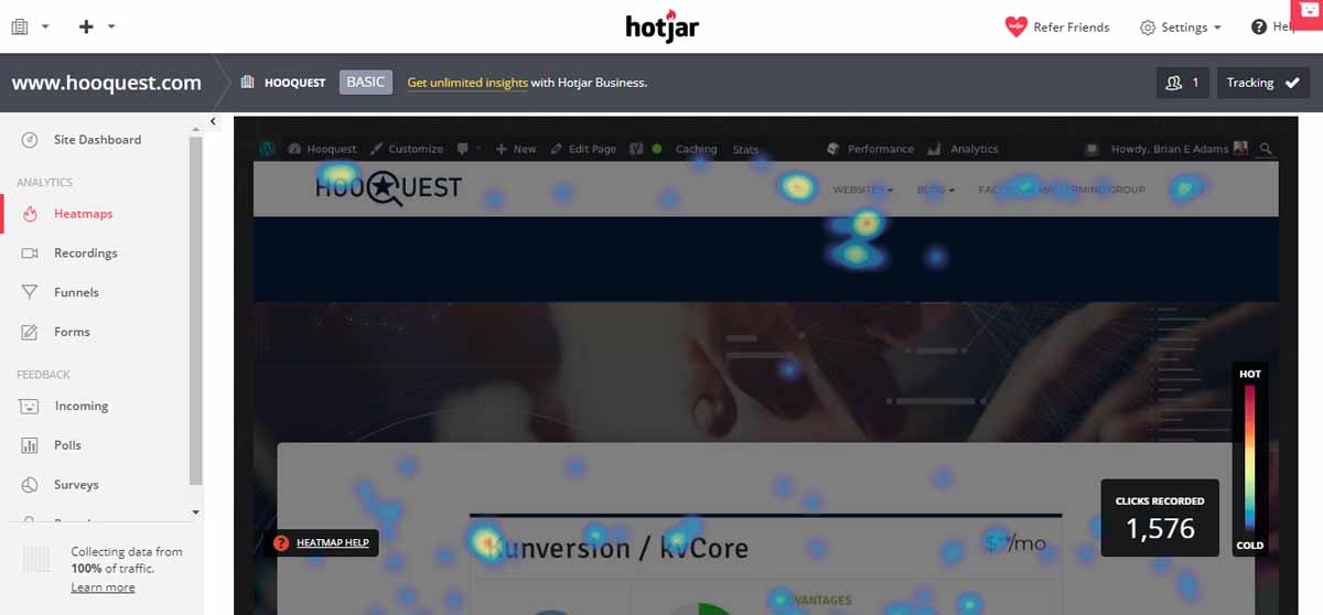
I’ve written about Hotjar on my list of free marketing tools already. It indeed is free to get started with a limited number of website visitors, and is fun to play with – I’d recommend giving it a go!
Hotjar creates both heatmaps and visitor recordings for desktop, tablet, and mobile users.
The picture above is a heatmap of my kvCORE page on this site. From this I can get a few insights. For example, I found once that a lot of people click on the Kunversion/kvCORE headline…but it’s not a link. That is obviously a subpar user experience.
Another thing I learned: I have videos embedded from kvCORE on my site. I thought it would be helpful for visitors to see kvCORE’s own videos and product introduction in addition to my review. Well, very few people click play on those videos. I still like including them on my product review pages, but they are not nearly as popular as I would have guessed.
Crazyegg
An alternative heat mapping tool to Hotjar is Crazyegg, a product from the prolific digital entrepreneur Neil Patel (he also has the free keyword search tool Ubersuggest).
In addition to the Hotjar tools, Crazyegg includes A/B split testing so that you can compare and iterate better website UI design right there within the tool.
UserTesting.com
Thick skin is a job requirement for a UX expert. You want the truth, no matter how much it hurts.
Enter UserTesting.com.
This site uses real humans who discover and interact with your website. They then give you real, human feedback on your site, UI, UX, and any pain points they encounter along the way.
There’s only so much that a computer can do. UX is subjective and human. Sometimes you need a human to just take your site for a test drive.
Google Analytics
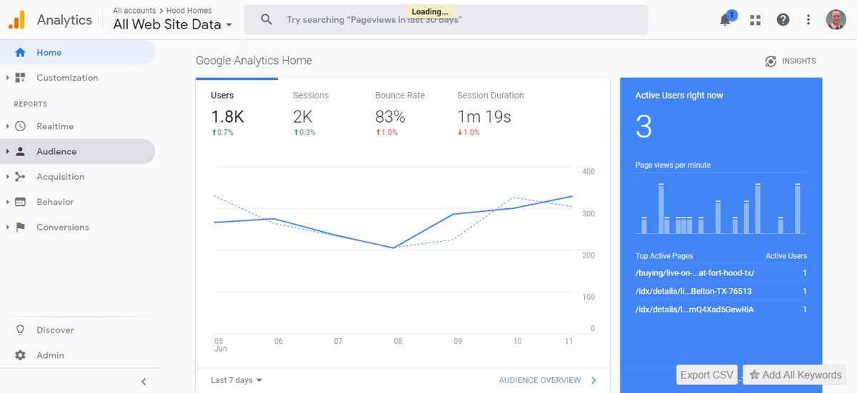
You should have Google Analytics set up for your site already. Hopefully you use it to track at least basic KPIs like monthly organic visitors.
And if you do have a website but haven’t set up Analytics yet, go do that right now. Like, seriously. Right now.
Google Analytics is incredibly powerful (and free) with more tools than I know how to use. If you want to nerd out on it, I recommend the YouTube channel Measureschool.
Two of the most prominent KPIs that might show a UX issue are bounce rates and session duration. The bounce rate is what proportion of visitors leave your site after viewing only a single page. A high bounce rate suggests you may not be giving the user a good experience. Similarly, short session durations, especially if under 30 seconds, can be a sign that visitors are quickly unimpressed with your page and moving on.
My own numbers are there in the picture. I’ve found that my bounce rate has always hovered around 80%, and my session duration around 1.5 minutes. Those numbers will change some depending on what kind of content you’re producing.
Google Optimize
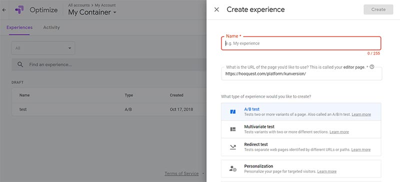
For advanced CRO pros, there is Google Optimize. Optimize allows you to split test different versions of your website, right within Google.
This isn’t worth your time unless you are getting a decent amount of statistically significant traffic on a few key pages at least.
Optimal Workshop
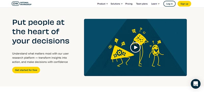
Optimal Workshop is a recommendation from Katie and used by the folks at TRIBUS.
It features research tools that track users through your site and can distill their behaviors into actionable information. Where are the bottlenecks in your site? What is their first impression of your site and brand?
It’s a option to consider if you want a one-stop-shop for UX and UI insights into your website.
UX Resources
Below are some resources you can check out if you want to dive more into UX best practices and trends.
UX Planet
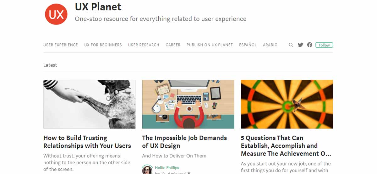
UX Planet on Medium is a giant repository of articles on UX. There were about 5 articles just published today and I’m sure it will sate your UX craving thoroughly. It includes a whole section on UX for beginners as well.
I didn’t find any real estate website specific content, unfortunately. But plenty about general best practices and tools.
UX Collective
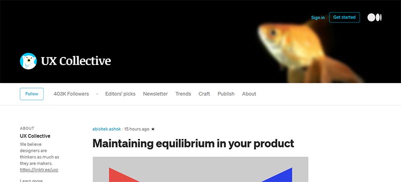
UX Collective is another website on Medium.
They have an case study about a commercial real estate client worth checking out. They walk through how they researched the real estate niche, built the customer journey, and designed the battle plan.
LinkedIn Learning
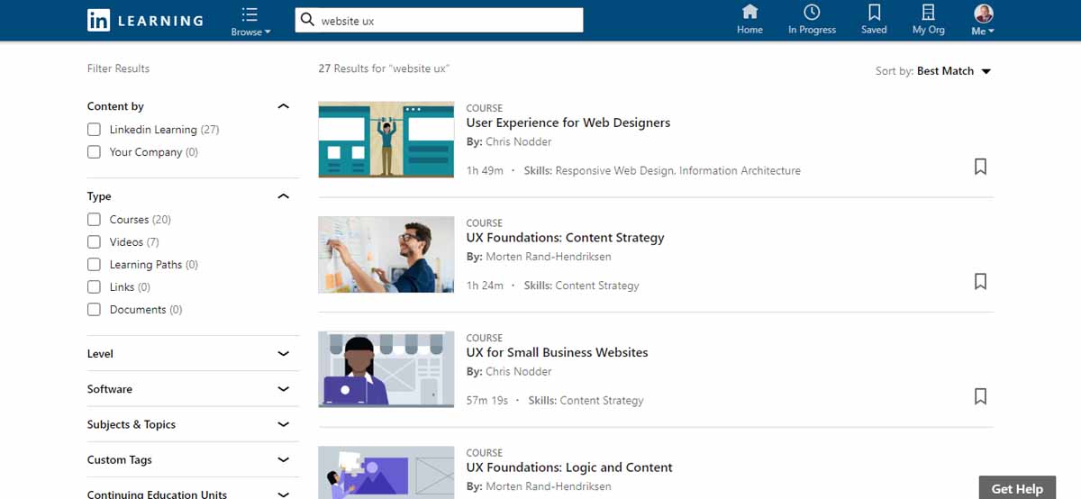
Formerly Lynda, LinkedIn Learning is a large database of online learning courses that can teach you a new skill. In this case, UX!
Unlike competitors Udemy or Skillshare, I’ve found that LinkedIn Learning has more professionally produced content and you’ll likely find the best stuff there. But the other online course hubs might be worth exploring as well.
Professional Help
A good web designer should have some UX design knowledge and skills. When selecting a website developer, ask them about UX and UI and what skills, tools, and techniques they use to ensure the best product for you. A beautiful website is useless if it is not usable.
You can also look to advanced, custom products like TRIBUS.
TRIBUS
TRIBUS is a real estate industry leader in website and custom software solutions. They are an enterprise solution with custom and semi-custom products for medium to large sized brokerages.
If you are a broker or real estate entrepreneur who takes your website seriously (and are looking for custom CRM and intranet solutions as well), TRIBUS is a company worth exploring!
Conclusion
Usability is the most important feature in software. In my product reviews, I emphasize usability above all else.
It is no different for websites. If your site is not user friendly, your visitors will move on. These is no shortage of competing websites where they can find real estate content. Every agent has a site. Zillow, Redfin, Realtor.com, and the brokerages all want your website visitor’s eyeballs. Don’t give them an excuse to leave with bad UX!
Updated December 28, 2020; Originally published June 14, 2019.