Easy Agent Pro Website Examples
 If you are considering Easy Agent Pro as your next real estate website provider, the first thing you probably want to do is look at some Easy Agent Pro website examples! Below are four agents currently using Easy Agent Pro for their website.
Easy Agent Pro’s design is one of their best features. Their sites tend to be colorful, with large calls-to-action and buttons, and an overall clean, fun, look. They are one of my favorites based on just design alone.
I recommend touring these websites. Pretend you are a buyer or a seller who has stumbled onto their website. Is it intuitive? Can you search homes easily? Are you eager to sign up? Is it easy to submit inquiries? Is it fun and engaging? These are all signs of good website design.
NOTE: Agents swap websites and CRMs about as often as they change clothes. Check for the Easy Agent Pro logo in the website footer at the bottom of the site to ensure the agents below are still using Easy Agent Pro.
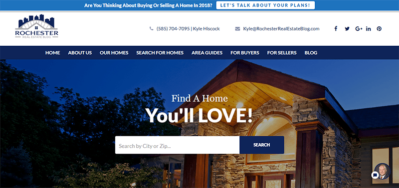
Kyle Hiscock – Rochester Real Estate Blog

Kyle Hiscock is one of my favorite real estate website owners and bloggers, and I highly recommend checking his website out not only for Easy Agent Pro examples, but in general when coming up with ideas for your own website, blog, and neighborhood information.
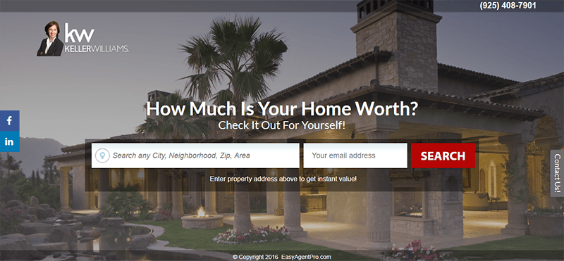
Denisen Hartlove – Find a Home to Love
Easy Agent Pro websites have a prominent “Find You Home Value” just below the fold, which sends users to a clean home valuation landing page like this.
Denisen’s home page design could be improved. At the time of this writing, at least in my Chrome browser, it has a large header that pushed the home search omnibar below the fold, and the gray and red clash making items very difficult to read.
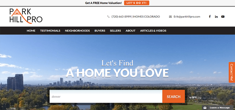
Erik Carman – Park Hill Pro
Erik Carman in the Denver area has an Easy Agent Pro website that perfectly shows how clean and sleek the design can be. He includes some video integrations with his as well.
Erik’s broker, iHomesColorado, uses Real Estate Webmasters.
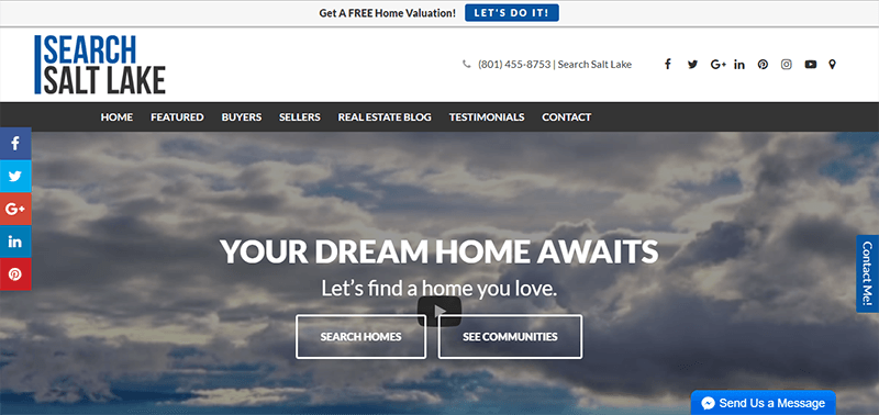
Dustin Brohm – Search Salt Lake
 Dustin Brohm is not only a Salt Lake area agent with the tech brokerage eXp Realty currently using an Easy Agent Pro website. He is also the host of the Massive Agent Podcast (referencing “massive action” and production, not plus-sized agents).
Conclusion
These are just a few Easy Agent Pro website examples. It is one of the better-designed websites, with clear calls to action, a modern look, and superb landing pages.
And Easy Agent Pro is just one of many choices when looking at your next agent website. Learn more about the pros and cons of Easy Agent Pro versus WordPress and Placester.


