7 Easy Agent Pro Website Examples | 2024
Below are some Easy Agent Pro website examples. Be sure to check out my Easy Agent Pro reviews as well.
Easy Agent Pro sites have a very unique, bold style that makes them easy to identify. They have vibrant colors that stand out and bold, sans serif fonts. I personally like it, but style is very personal.
Below are a handful of agents I’ve identified myself as using Easy Agent Pro for their website. Be sure to check that these agents are still using Placester. Agents change websites more often than they change clothes, and it is possible they have switched to a new website provider since this writing. With Easy Agent Pro, there is usually a logo in the footer.

Easy Agent Pro
$179+/mo, $199 setup cost. Easy Agent Pro gives a good balance of performance vs ease of use. Easy Agent Pro websites have a rather recognizable design that is sharp, colorful, and modern. It comes with add-ons and tools like sharing landing pages on social media. It is a strong solution for any agent wanting to take their web presence seriously, use landing pages generously, and without having to be too technical themselves.
Easy Agent Pro Website Examples
Kyle Hiscock – Rochester Real Estate Blog

Kyle Hiscock is one of my favorite real estate website owners and bloggers, and I highly recommend checking his website out not only for Easy Agent Pro examples, but in general when coming up with ideas for your own website, blog, and neighborhood information.
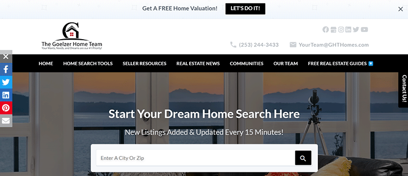
The Goelzer Home Team
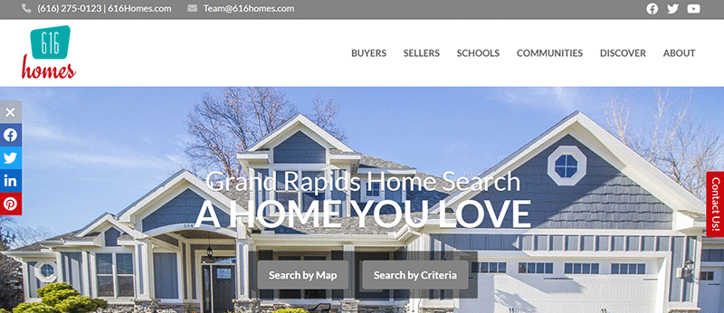
616 Homes
Karin Carr -Georgia Coast Homes
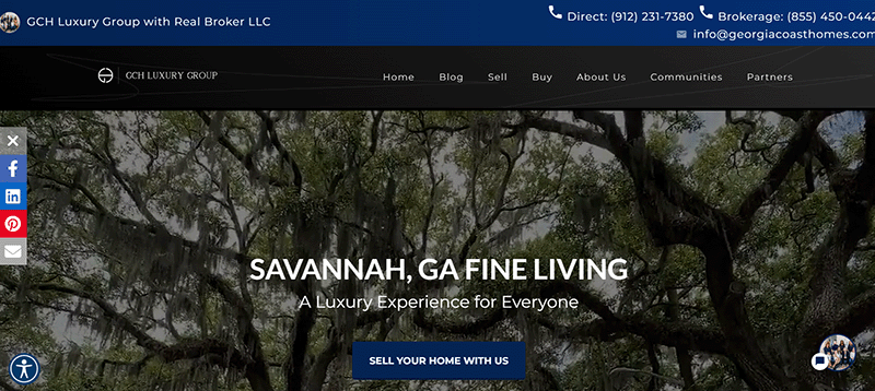
Karin Carr is a YouTube coach and worth following.
Her website is also an Easy Agent Pro site!
Daniel Keeton – Goochland Living
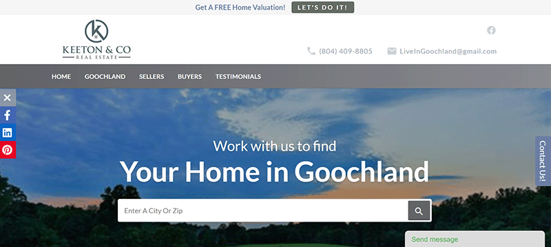
Easy Agent Pro websites have a prominent “Find You Home Value” just below the fold, which sends users to a clean home valuation landing page like this.
Denisen’s home page design could be improved. At the time of this writing, at least in my Chrome browser, it has a large header that pushed the home search omnibar below the fold, and the gray and red clash making items very difficult to read.
Erik Carman – Park Hill Pro
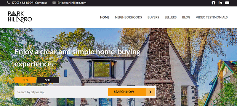
Erik Carman in the Denver area has an Easy Agent Pro website that perfectly shows how clean and sleek the design can be. He includes some video integrations with his as well.
Erik’s broker, iHomesColorado, uses Boomtown.
Brad and Karen Mattonen – Homes in SD County
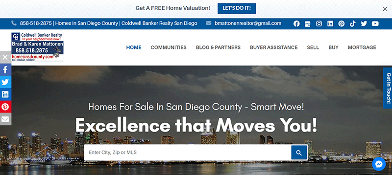
Brad and Karen Mattonen are a husband and wife duo in San Diego with an EAP website. Their site features a focus on community pages and buyer resources.
I Love It!
Do you like these Easy Agent Pro examples? Learn more at the Easy Agent Pro website..

Meh, Show Me Something Else
Not impressed? Check out my other suggestions and agent website reviews.