Real Estate Logo Examples from the Top 36 Teams
Ready to get a new real estate logo for your business?
That’ll cost you $250,000.
Haha, just joking.

But if you’re looking for a new logo for a new real estate business, or interested in updating your own, you and NAR are not alone! Zillow made their own logo update. As did eXp Realty not too long afterward as well!


I’m assuming you already have some idea of what you want in a business name, real estate brand and brand colors, and mission statement. You’ll need all three before you consider a logo.
The Top 36 Teams’ Real Estate Logos
I love looking at the top real estate companies to help brainstorm for my own real estate business.
Let’s do the same for a logo!
I went through Real Trends list of top teams in 2022 – the rankings of mega teams by volume. I took liberties with a few logos to make them conform to a 300×300 square.
Below are real estate logo design samples to get your creative juices flowing!
Components of a Great Logo
Smashing Magazine has a list of the 5 features that make a great logo:
- Simple
- Timeless
- Versatile
- Appropriate
- Memorable
Simple
Many logos have too much detail.
Compare, for instance, these two flags. One can be easily drawn by a kindergartener. The other, not so much.
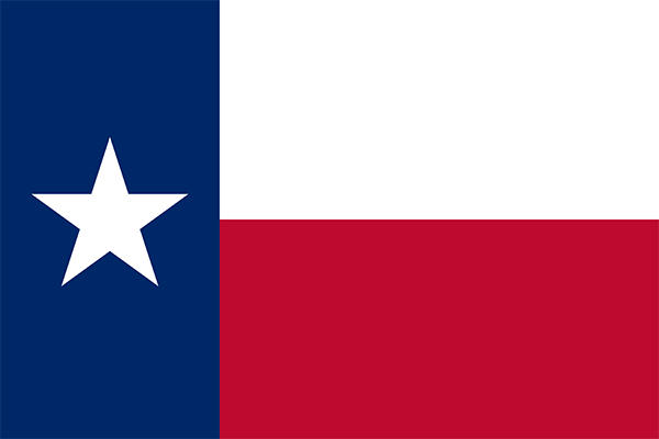
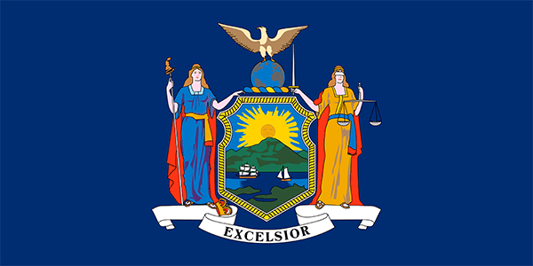
Little wonder Texans are known for their State pride. We have great iconography! Do you even know what State the other flag is from?
We also have an awesome state anthem, but I digress.
Here are some of my favorite examples of simple real estate logos.
Timeless
Tailor Brands describes a timeless logo as:
Timeless logos focus on quality over quantity, removing many of the unnecessary elements and crazy ideas and focusing on what works. This means focusing exclusively on your brand’s core ideas and values to uncover the most effective way to transmit them without unnecessary clutter. Another important aspect of timeless logos is that they keep colors simple and basic, ignoring gradients and massive palettes in favor of more selective and unique colors.
NAR’s logo is 50 years old, I believe.
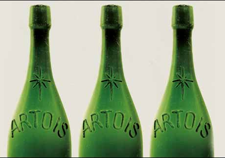
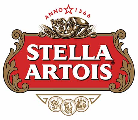
That is some pretty good longevity, but doesn’t hold a candle to the oldest corporate logo in the world. A brewery, of all things:
Versatile
A versatile logo is one you can use in many situations. Small. Big. Long. Square.
You may want multiple mock-ups of your logo. A Black and white version. A white version on transparent background.
Established companies will often have a press kit or media page with all their logos available for public use, like when reporters are doing a story. Having several versions of your logo that can go with a variety of purposes is invaluable in these situations.
For example, here is the press kit for Homesnap. Very well done!


Appropriate
You want a logo that is appropriate for your industry, your niche, and your brand.
Luxury brands might be more elegant, with serif fonts. More casual brands might have bolder colors and be abstract.
And if you can communicate something about real estate, even better.
The way many logos accomplish that is by incorporating the sloped roof of a house.
For example:
Clearly, they know something about the sloping roof of a home and what that can immediately communicate to home buyers and sellers new to your brand mark.
It’s handy to have a logo that communicates what you are about: homes.
Memorable
So I will now immediately backtrack on what I just said and mention there is a danger of following along the prevailing norms a little too much.
Below are the logos for Ylopo, Home Junction, Inside Real Estate, and RealSatisfied. Can you tell which is which?




Doing something extra to make yourself distinct is important to becoming memorable. Just because the house shape is popular and a great way to communicate what you’re about doesn’t mean you want to blend in.
Other Ideas
Don’t forget: just like your business name and brand, your logo has to be something you like.
A well-structured logo should also “fill the space”. It doesn’t have to be symmetrical, but you don’t want an oblong shape. Ideally, it should be able to fit aesthetically within a square.
Below is a worthwhile video from Vox featuring Logo Master Michael Bierut talking about logos.
Logo Mistakes
Don’t:
- Use gradients
- Use stock art
- Use multiple fonts
- Have a logo that looks bad in black-and-white
- Choose clashing or illegible colors
- Steal other people’s logo concepts
Check out this list of worst logos in the world if you still need ideas on what not to do.
How to Make a Logo Yourself
Canva
Everybody knows Canva! Everybody loves Canva!
You can do a lot here, including making a logo.
That said, Canva probably takes some work to get a truly unique logo with no stock imagery. I probably wouldn’t recommend it.
Adobe Illustrator
Ok, so you’re ready to go pro and do it the right way. Adobe is still king of the hill in the creative space, and Adobe Illustrator is probably the tool you would use to make a logo.
That said, it ain’t free. Illustrator is if you want to take your logo seriously and plan on frequently building graphics for your marketing products.
Formatting
Your logo should be in a vector file. These are files that most commonly end in “.svg”.
Vector files essentially use lines instead of pixels. Therefore they can be scaled big or small with no loss in quality and still a small, web-friendly file size. This allows you to use your logo as a tiny favicon or in a giant, building-sized ad.
Free Logo Generators
Don’t use a logo generator for your logo!
I strongly recommend getting a professional logo. Free logo generators use templated icons, fonts, and colors that can’t be guaranteed to be unique to you.
But, logo generators are great for brainstorming some ideas.
Some of these will charge for a final logo download. Others offer tools like these hoping that some users will turn into paying customers for their other services like business cards.
Below are a few of the generators I found and played with.
Where to Get a Professionally Designed Logo
And now we’re finally to the most important part of this article!
As I’ve mentioned, getting a pro to create a real estate logo for your real estate business is the course of action I recommend. It is affordable.
You can get it in the correct format. It will be unique. It will be professional. There’s nothing not to like.
Below are the three companies I would consider, depending on what level of business you are running.
1000Watt
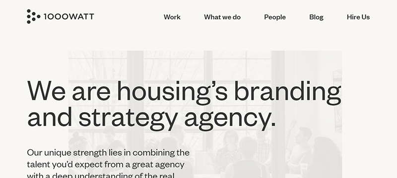
1000Watt is one of the premier branding and marketing firms for real estate enterprises.
They’ve been involved in the brand redesigns for companies like Realty Austin and Referral Exchange.
I recommend their site as a great source for industry hot takes, as well as exploring some of their projects for inspiration.
They have the most experience specific to real estate logo design.
Fiverr
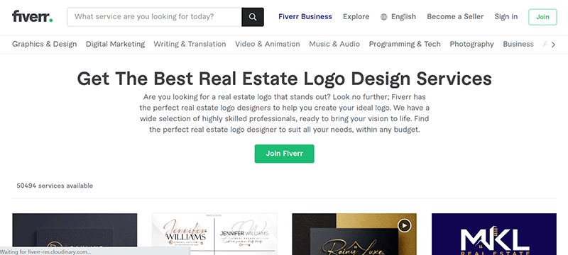
Fiverr is the go-to shop for graphics gigs like custom logos, and an affordable option for a newer agent.
This is probably a new agent’s #1 destination for professional logo design.
99designs
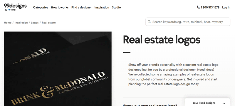
99designs is another top destination for done-for-you logos.
The price is higher than what you can find shopping around on Fiverr. But you get a more complete and predictable final product with more features.
Conclusion
A logo is not going to unlock success for your business. It is not why these top producer examples acheived the heights they have. Some top producers just have their name in typeface as a logo!
I hope you’ve found this to be a useful resource for creating a logo for your business!
Please share more about your own logo ideas and experiences in the comments!
Updated March 31, 2023; Originally published August 10, 2019.
