6 BoomTown Website Examples | 2024
Below are some BoomTown! website examples. Be sure to check out my BoomTown! reviews as well.
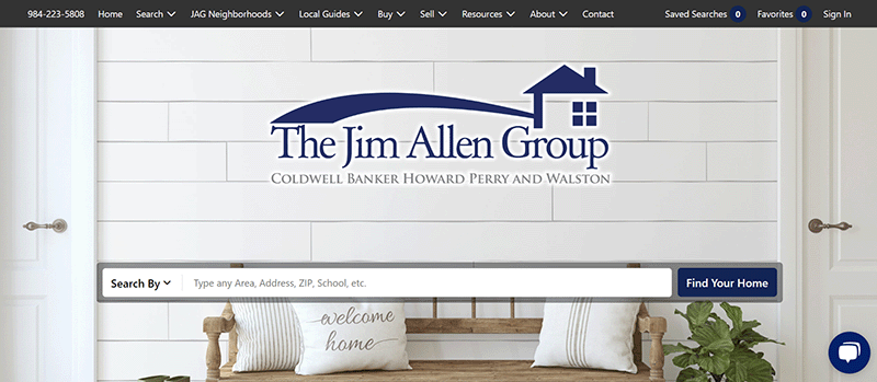
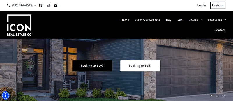
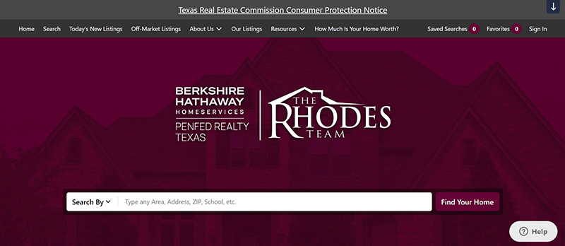
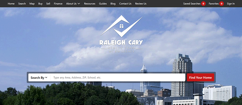
BoomTown! websites are very sleek, and remind me of the same design principles used for Easy Agent Pro websites, which I very much like. That said, every BoomTown! website looks alike. Once you’ve seen one, you’ve seen them all, just rebranded with different pictures and content. That isn’t necessarily a problem, because the BoomTown! model is conversion optimization, hitting the phones, and churning leads into closings.
If you are very particular about what you want in your website front end, BoomTown! is probably not for you. But it must be doing something right, as all of the examples shared here are from Real Trends top teams list from 2017, and all 10 of these teams were in the top 35, doing at least 637 deals a year.
Be sure to check that these agents are still using BoomTown!. Agents change websites more often than they change clothes, and it is possible they have switched to a new website provider since this writing. To confirm, BoomTown! prominently displays its logo in the footer of their websites.

BoomTown
$750+ setup; $1000+/mo. BoomTown is a favorite in the industry, known for its robust paid lead generation. It is one of the more expensive products, designed for top producing teams and brokerages who are ready to work the phone.
The Jim Allen Group
Icon Real Estate
The Rhodes Team
Redzuan Razak

Jillian Bos

Raleigh Cary Real Estate Team
I Love It!
Did you like any of these BoomTown examples? Learn more at the BoomTown websites and browse pricing, packages, and their additional services.

Meh, Show Me Something Else
Not impressed? Check out my other suggestions and platform reviews.