Ultimate Guide to Real Estate Branding With Examples in 2023
Whether you are starting from scratch or reinventing yourself, spending time on your real estate brand sooner rather than later will save you headaches down the road. Once a brand establishes itself in the mind of the consumer (for better or worse), it can be very hard to change it. You need to get it right at the starting gate!
Table of Contents
Start With Your Values
Your brand is the impression you leave on consumers.
That impression should include your values. Trustworthy. Effective. Diligent. Fun. Professional. Your branding decisions should be a reflection of your values.
These are not only your values, but also your value proposition. You may also want to take your niche into mind.
You can’t build a brand until you have your mission statement.
Is professionalism your watchword? Then minimalist designs with sans-serif fonts and dark blues might be your thing. Your brand’s voice is “knowledgeable”. You can be engaging and fun even when writing for a professional audience, but you might leave out anything “wacky”.
Conversely, are you the fun, local expert? You have bright colors, fun (but readable!) fonts, and lots of action! Depending on your target demographic, maybe your brand even allows for the occasional explicit word like marketing platform Curaytor, (though I generally recommend against that).
Keep your values in mind as you build your brand and voice.
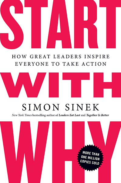
Start With Why: How Great Leaders Inspire Everyone to Take Action
Simon Sinek
Business coach Simon Sinek wrote Start With Why, a fantastic book about how successful business leaders begin with their mission.
It may seem like common sense, yet countless businesses fail to inculcate their mission.
The consequence is a decision-making process that is misaligned with company goals, wasted effort, and, ultimately, failure.
Tell Your Story
Authenticity is going to be the most important part of personal branding. That begins with your own “Why”. Communicating your background and why you are in this business is important for reaching and empathizing with your target demographic.
For example, I got into real estate because I was interested in real estate investing. I bought a multi-family as an owner-occupied residence, and talked about my experience on my own site and other investor forums. My authentic experience and story resonated with many other multi-family investors, and ultimately earned me a significant amount of business. Nearly a third of my real estate business comes from fourplex and duplex investors, almost accidentally, because of my authentic experience and background with multi-families.
Customer Avatar
Now that you’ve thought about yourself and who you are, you want to think about who your customer is.
That means making a customer avatar.
Your avatar is a fictional representation of your target audience. What kind of person do your values appeal to? Who is in need of your niche services? What is the personality you want to work with as an agent?
Nailing down a customer avatar will allow you to consider your brand from their view, and target your marketing efforts to what appeals to them.
Example: Compass
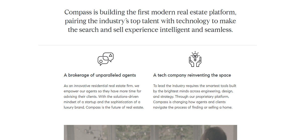
Compass has stormed into the brokerage space nabbing agents and teams left and right from more established brands. They’ve done this in part by being crystal clear on who they are and what they offer agents: top agents with great technology. They are not shy about pitching themselves as a technology company first, and they orient their brand around that core mission.
Choosing Your Name
I’ve written another article about what to consider when choosing a name.
Some of those principles include:
- Short names
- Easy to spell
- Easy to pronounce
- Good acronyms
- Normal spelling
- No Numbers
- No Keyword Stuffing
- Geographic Tie In
- Meaningful Name
The last element, a meaningful name, is why we started with building your mission statement and defining your values. You ideally want a business name and brand that will communicate those values.
Also, don’t forget to test your name! Google it! Think about it as an acronym. Make sure you don’t share a name with a famous porn star who is going to show up when people google your business instead of you.
Example: Indy Home Pros
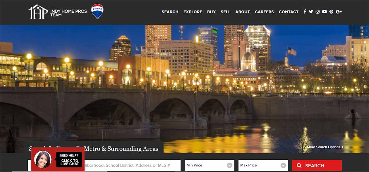
I love the Indy Home Pros name. It has it all in just a few words. It communicates their service area (Indianapolis), their business (Real estate), and their value proposition (they’re pros!). And they did it in 12 characters instead of something like “Victory Indianapolis Real Estate Team”.
And “IHP” isn’t a naughty acronym, to my knowledge.
What do You Need in the Website URL
www.BrianEAdamsSells.com
www.KilleenTXHomeSearch.com
These are … not good URLs. Yet so many agents seem to fall in love with some variation of these two website URLs.
The first fails because I could never sell the URL “BrianEAdamsSells.com”. That is only good to me as long as I am in my business. Maybe you have no intention of “selling”, but your brand should be bigger than you.
The second one fails first because it’s actually quite hard to remember. Is it “search” or “find”? “Home” or “house”? “TX” or “texas”? It’s really not a brand at all.
The second URL also is commonly adopted from a misconception that your URL still matters for SEO. E.g., a home buyer types in “Fargo, ND homes for sale”, then the website www.FargoNDHomesForSale.com is more likely to appear in the search results.
That is false. (I just tested it by searching those keywords – only two of the top ten results even had “Fargo” in the URL at all). Don’t pick a URL thinking that it is great because it contains keywords. You are building a brand. “Fargo ND Homes For Sale” is not a brand.
Therefore, your website URL should be your brand name. If you are the Fargo Home Team, then that should be your URL.
NOTE: My own website is www.HoodHomesBlog.com. On reflection, I very much failed in my own URL name. I should never have had “blog” in the title because it doesn’t sound like a real estate site. But it’s too late now and I am just going to own it.
Easily Shareable
Avoid numbers. Is it FirstTeam.com or 1stTeam.com? You’ll find yourself constantly explaining over the phone how to spell your URL.
Similarly, you want to avoid unusual spellings. My own brokerage probably failed this one: StarPointe Realty. I am always clarifying “StarPointe with an ‘e’ on the end of ‘pointe'”. Who knows how many people never found our site when searching starpointrealty.com.
Lastly, you want something as short as practical. More characters mean more opportunities for typos. And keep in mind that your URL will likely be your email, and [email protected] is a quite an email. And nobody can spell Albuquerque on the first try. Under 12 characters is best.
Example: Search Salt Lake
Picking Colors that Appeal
Now the fun part! Colors, fonts, and more!
Document Your Brand
Before you start, though, get out a Word document and write down your choices. Document your brand!
You’d be surprised how many well-established brokerages and agents have no clue what color or font they’ve used for their branding. The result is that you might use several different colors – maybe a few different shades of red, for example – that then clash when together. Document everything about your small business from the beginning and be consistent! Consistency is key to imprinting your brand and message in the mind of the consumer.
I have a Word document with a list of my brand color hex codes, fonts, font sizes, and more. I’ve even downloaded the fonts I use in case I have to install them again on a separate computer that doesn’t have them standard.
Enterprises have all this informtion in their media kit. Homesnap has an awesome example of a press kit that shows exactly their fonts, colors, and logo permutations.
Colors
Picking colors is more than just clicking on a color that appeals. You need to be deliberate about the colors you choose and be sure to write them down so you know exactly what colors your business is built on.
Here are three colors at a minimum you should start with:
- First Color: Your business’s main color. Mine here at Hooquest is not just “navy blue”, but very specifically HEX CODE #041E42
- Call-To-Action Color: This color should stand out against your primary color, and that you use almost exclusively for buttons. This is your “call-to-action” color, pulling people’s eyeballs to the action you want them to take on your website. Mine here at Hooquest is yellow, HEX CODE #FCC000.
- Second Color: Sometimes you will need an additional color (or two or three) when making graphs or distinguishing a design element from your primary color. The second color is often a lighter or darker variation of your first color, or a similar color that won’t conflict with your Call-To-Action color. My second color at Hooquest is HEX CODE #00538C, a slightly lighter navy blue.
Where is a good place to get color ideas? I recommend from the experts in branding – your favorite sports league. Every NFL, MLB, NBA, etc franchise is an expert branding, and you can check out their colors for inspiration.
Lastly, you want to choose a main color that appeals to you and your business message. Read up more on the meaning of colors and how it reflects on what you are trying to communicate with your brand.
Getting the Fonts Right
A great font isn’t as important as a great color. Fonts are easy to change.
But now is a good time to pick your fonts quickly. Don’t spend more than 30 minutes doing this. You have plenty of other things to be doing than choosing between Arial or Calibri.
Headline Font: You can get a little bit creative with your headline fonts, going with either a serif or sans-serif font, as long as it is still readable. My headings font as of this writing on Hooquest is Signika.
Text Font: You almost surely should choose a very readable sans-serif font. My paragraph font on Hooquest is Lato.
The best place to find fonts is Google Fonts. Do not choose anything that is monospace. You can generally download all these fonts easily and implement them into your website as you like. Or you can look at the standard fonts available in your website theme.
Inventing a Slogan that Converts
On my real estate website, I’ve experimented with a couple different slogans:
“Everything you need to know about Fort Hood, TX Real Estate”
“Buy, Sell, Learn, Explore Fort Hood, TX Homes”
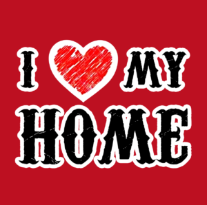
I also have an “I [HEART] My Home” graphic that I like to use. Combined with my recognizable and consistent fonts and colors, these immediately identify my brand in the mind of the consumer.
Go back to your values. You want a message that quickly communicates what you do and why a buyer or seller should consider you as their real estate agent. A variation of your core values might make a great slogan!
Example: Homegenius

Homegenius did more than just pick a few colors. They created a color code for their agents to pick from, selecting colors for their own individual brands and teams that match their own style and strengths, all within the brokerage’s branding. Each color has significance and communicates a personality, value, or specialization.
Making a Sweet Real Estate Logo
I’ve written another article that includes a deep dive into real estate logos, including the logos for the top 48 real estate teams in America. The 5 main principles of great logo design include:
- Simple
- Appropriate
- Versatile
- Timeless
- Memorable
I’ve made my own logos, for better or worse, in Photoshop. I’m not a photoshop wizard by any stretch, but my logos have been fairly simple ones.
It’s probably best to outsource this step unless you are a graphics wiz. Fiverr and 99Designs are great places to get lots of design choices for as little as $5 (though likely a little more than that for a quality design).
When creating logos and graphics, you’ll want to consider the following places you might use a logo and the dimensions:
- Facebook Banner
- Gravatar
- LinkedIn Profile
- YouTube Cover Image
- Instagram Profile Image
- Office swag
- …etc
Think about other social media, video marketing, or other use cases for your logo. Make sure you or your designer have variations of your logo in each dimension.
For items like gravatars and square logos, you may need a couple versions of your logo if your basic logo isn’t one-size-fits-all. For example, here are my two logo iterations for this site and my Hood Homes Blog site:

[one_half][/one_half]

[one_half][/one_half]

[one_half][/one_half]

[one_half][/one_half]
One is my full logo, while the other is a square that fills in nicely for my gravatar or maybe a Facebook thumbnail picture. Yes, they’re similar, and yes, I’m not the most creative person in the world. But I think they’re okay!
You might also want to consider making all your logos with transparent backgrounds and saving as png files. That way they look good on any background instead of being surrounded by a white box on a background of a different shade or color.
Example: Red Oak Realty
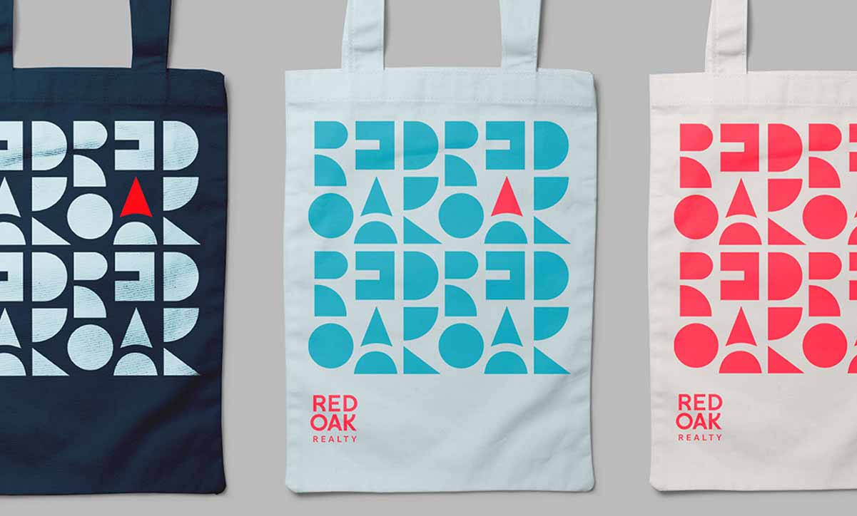
The marketing company 1000Watt created not just a unique logo for Red Oak Realty, but used the negative space behind the logo to create a unique brand iconogrpahy.
This design has been creatively incorporated into all their print materials as well as yard signs and ads.
Branding Yourself Offline
Real estate is not an online business.
Your brand lives offline, in you, your team, your values, and in your customers.
The most important element to having a great brand is providing great service. That’s beyond the scope of this article. But bringing your brand designs into the real world and off of Facebook and your website is as much as building your brand as choosing a logo or font.
Yard Signs, Print Materials, and Swag
Now that you have your brand, you’re ready to update your swag.
Your yard sign and business cards will likely be #1 on your to do list. I recommend BuildASign to get that done.
Merchandizing
But why not take your brand a level up?
If you’ve picked a solid brand, tagline, or memorable logo that ties to your community or homelife, it can make a popular closing gift. It’s possible you could even sell merch to non-clients!
Something like “I [heart] my home” would look great on branded materials and closing gifts, and give your happy customers ways to represent your brand to the public at large.
That’s all the “Home T” business did, and made a fortune on their Shark Tank experience.
Example: Realty Austin

Realty Austin makes money doing more than just real estate. For example, they sell advertising space on their Austin relocation guide!
These mugs are one example of the different ways the Realty Autin brand can be repurposed to many different elements while retaining the brand feel and message.
Resources to Stay on Top of Branding
Here are a few resources to explore for a deeper dive into branding your business:
- Branding Magazine
- HubSpot Branding Resources
- On Brand: A Podcast About Branding
- The Brand New You Show
Branding Agencies
The examples I used in this article are cribbed from the great work of 1000Watt, the premier real estate marketing and branding firm in our industry.
Even if you don’t have an enterprise budget, I recommend browsing their site for real estate branding ideas and inspiration. They have numerous projects, particularly the ones labeled “identity”, in which they’ve crafted new names, logos, and ethos for brokerages across America.
A few other companies to check out who are focused on real estate marketing strategies include Brandish Studio, Two By Fore, The Lones Group, or DeSantis Breindel.
Reputation Management
A big part of building a brand is defending it.
Once your brand gets a bad reputation or bad word of mouth, it can quickly snowball, and you can watch your referral lead generation dry up.
Defending your brand begins with you and your own, personal brand. If you mistreat customers or staff, your brand will suffer. If you make a mistake during a transaction, own up to it and make it up to your clients.
You will also may want to consider reputation management services like Power Testimonial, FiveStars, or RealSatisfied.
Conclusion
Some branding decisions early on are very reversible (fonts, slogans). Don’t put too much time into them now.
Other branding decisions are extremely difficult to change (team name, website URL). These deserve your attention and careful consideration, and perhaps even some professional help.
And remember – whether deliberate or not, you will have a brand. Take control of that brand!
Updated March 29, 2023; Originally published September 4, 2018.

